Crown Paints
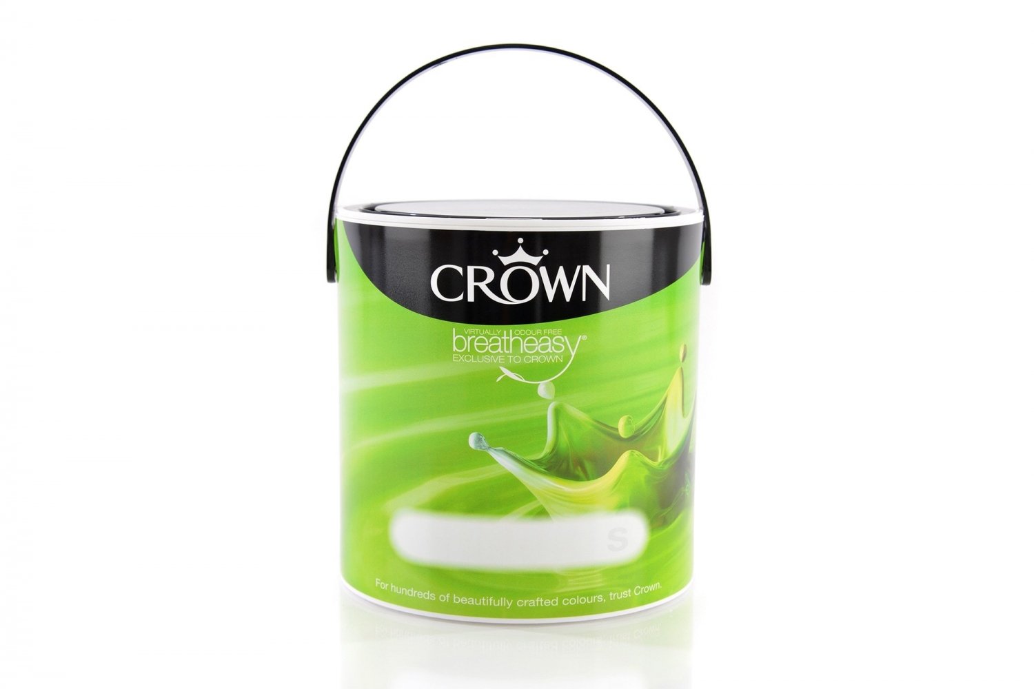
The Crown Paints core colour range required labels in eight different colours, covering both 2.5 litre and 5 litre options, in Matt, Silk and Mid-Sheen.
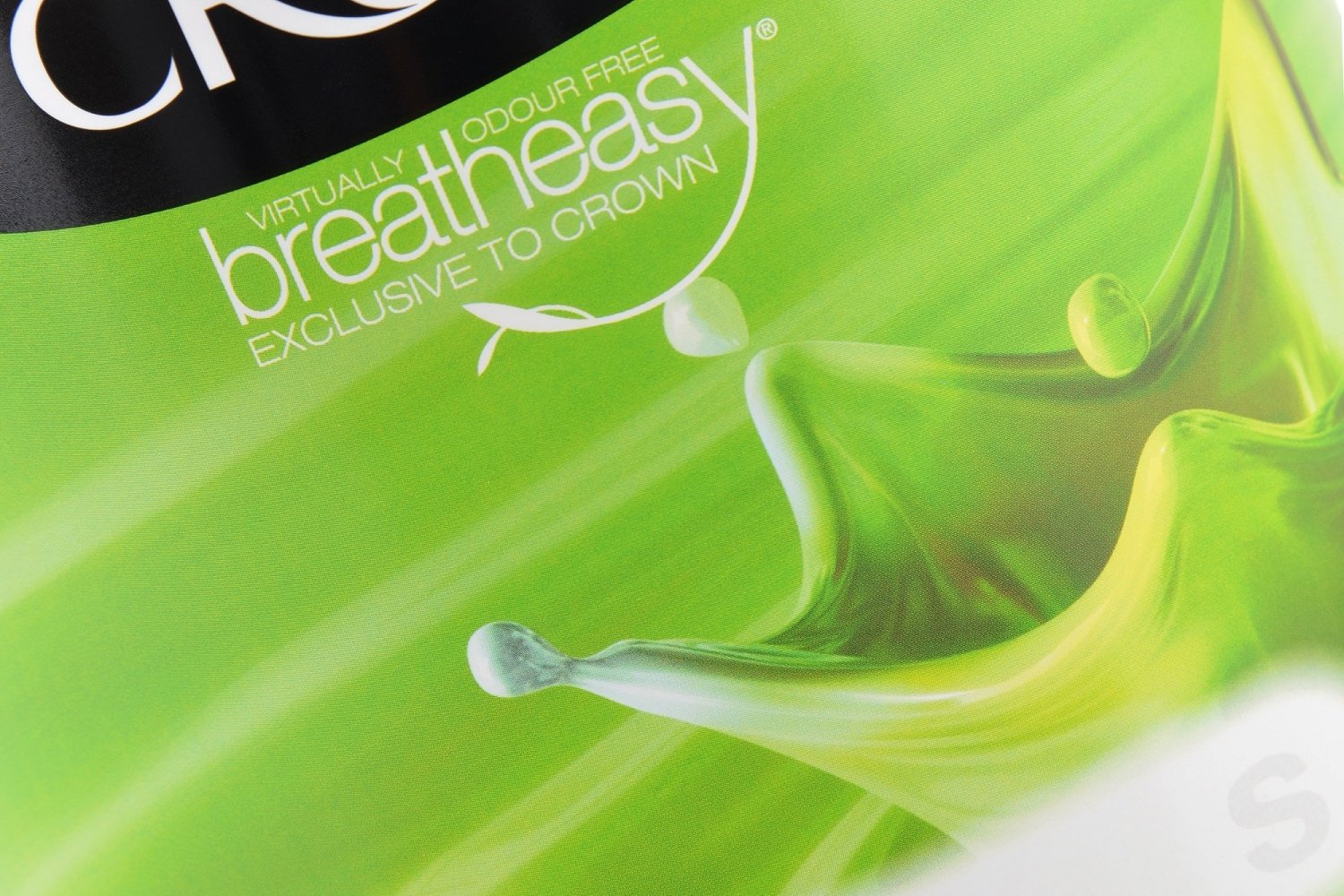
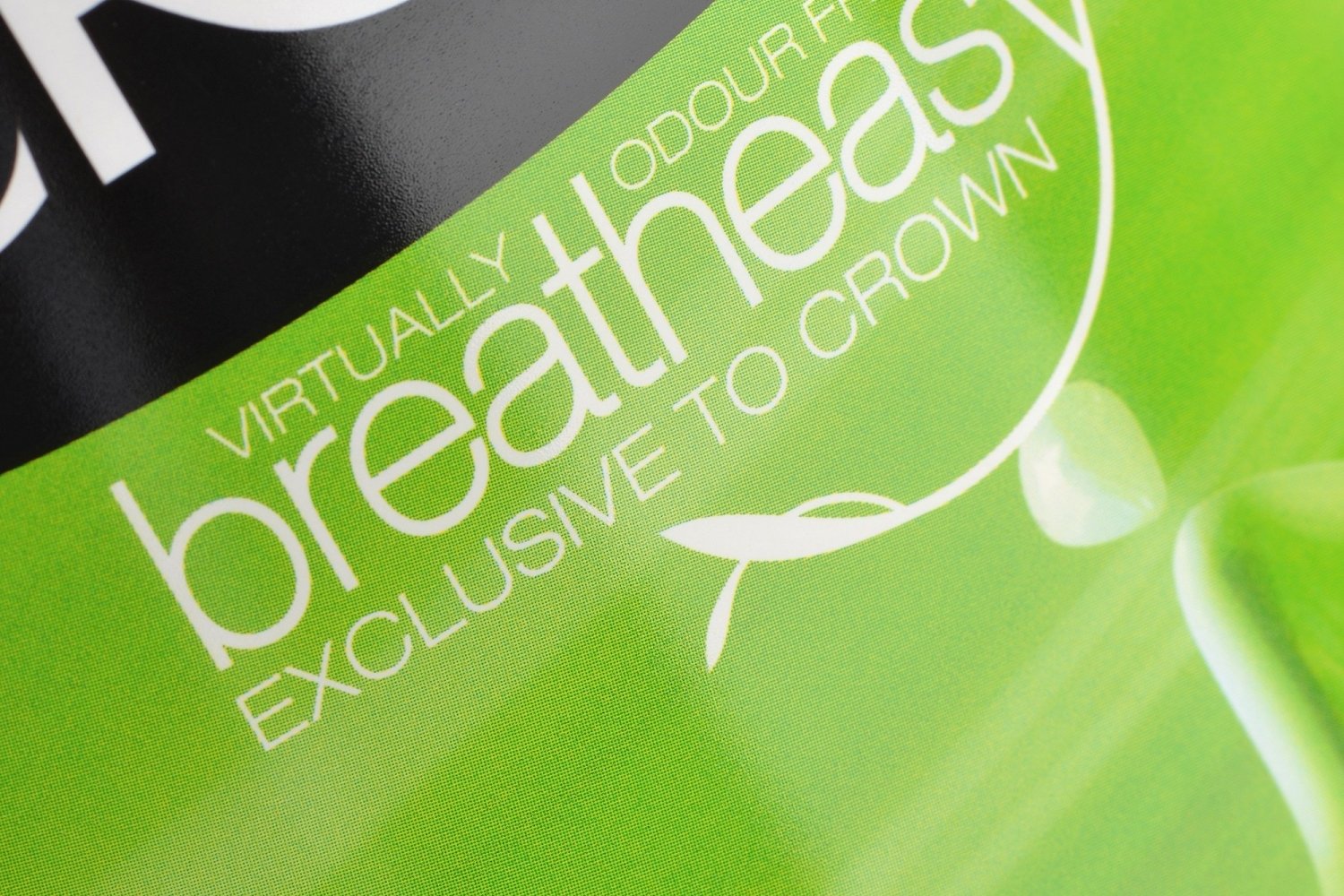
The colour of the paint is cleverly mirrored on the packaging. Due to the range of colours - from vibrant and bold, to soft, delicate pastels - it was necessary to print using a mix of CMYK and spot colours. The design on the label has undergone an overhaul. It depicts a drop of paint landing in a pool, forming a crown-shaped wave that reflects the brand name and logo. The image fades away in places, which requires a high-quality print so as not to lose the amplified detail of the splash of paint. A lot of time went into moving the printing process from litho to our high-quality flexo printing press. The label is printed on to a white PE material.
